Career and Life Lessons from 2 Years as a UX Researcher
29 July 2019
9 Mins Read

Morenike Olusanya
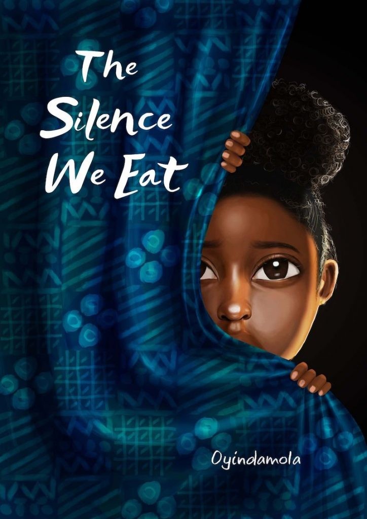
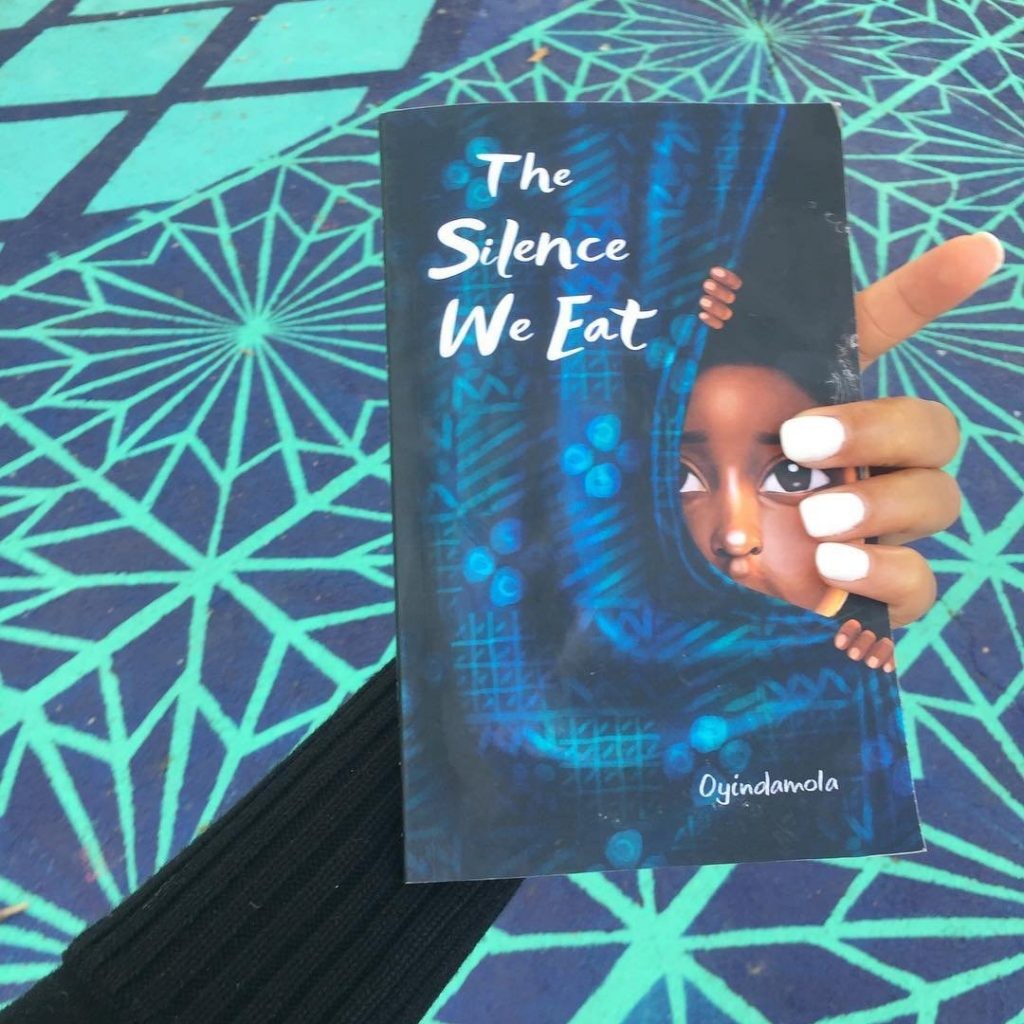
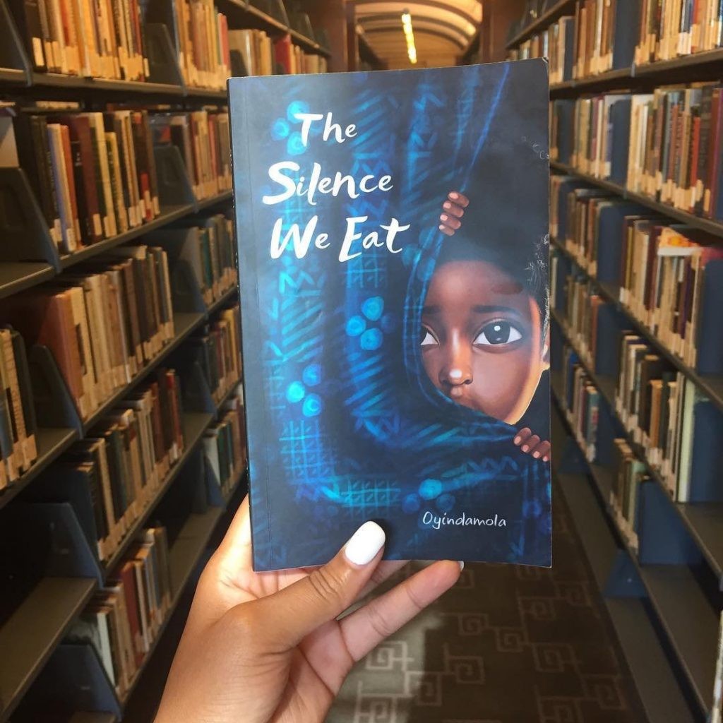
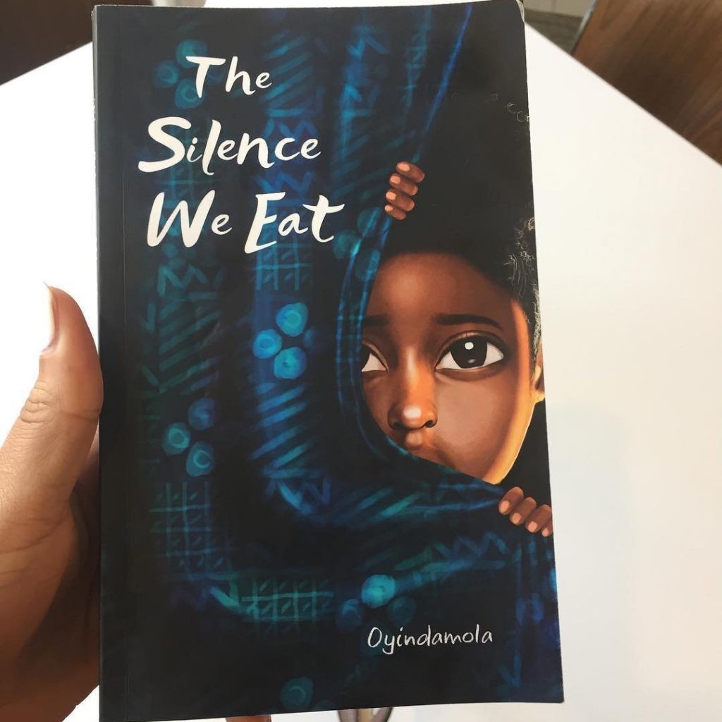
The Silence We Eat—Cover Design
Background
The Silence We Eat is a Poetic Prose Anthology about women forced into silence and affected by some form of abuse or the other. In the words of the author, Shoola Oyindamola, “The Silence We Eat merges stories of places where women have walked, and their bodies have survived. It is about the trajectory of silence and how it leads us home, sometimes, to find our voices.” Oyindamola shows us that often, silence is deafening, detaching, choking, empty, and fading but then, it becomes finding, rediscovering, healing, and wholeness.
Statement of Problem
The author initially didn’t have a very clear idea of what she wanted (the first problem). The second task was to create a book cover that best portrays the message the subject matter/content and at the same time, is attractive enough to draw people’s attention.
Solution (Approach, Rationale & Execution)
The manuscript was requested for, to get a very broad idea of what the book was all about (since there was no clear request for how the book cover should look initially). I felt it was extremely important to understand the content of the book before going ahead to design or create the book cover, so I read the book.
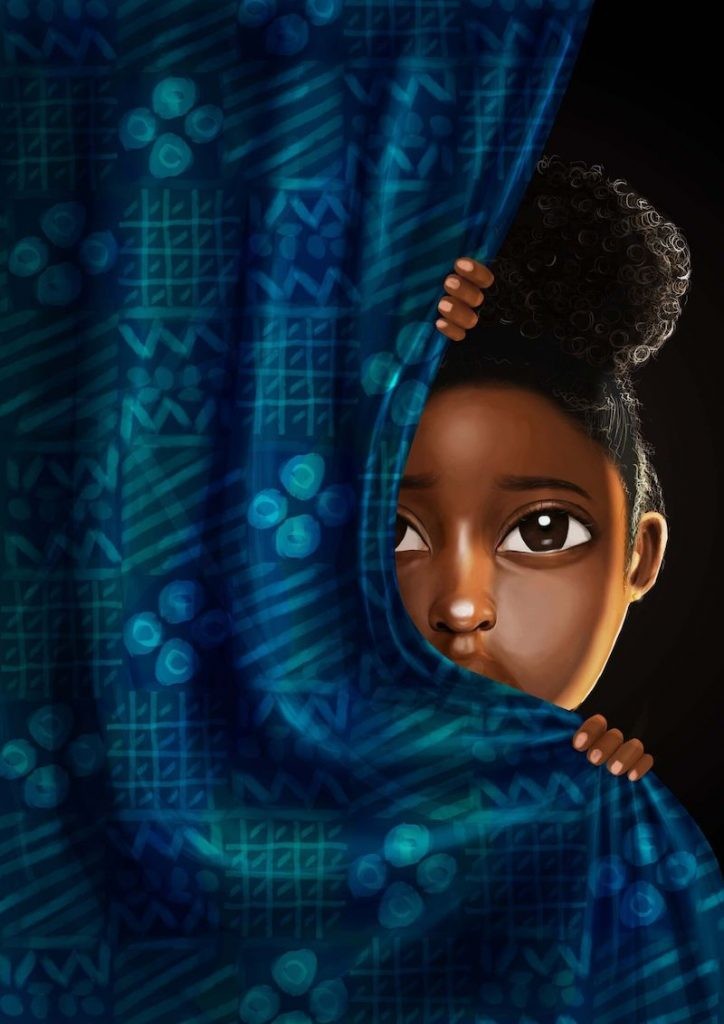
After reading the book, I noted that it had a lot to do with silence and abuse. My inspiration was gotten from a part of the book that talked about a child being shown some form of abuse by her parents. It hit me because I personally believe that when a child is exposed to such scenarios, it lives with the child and affects the child’s life in ways they cannot control. So I decided to paint the scenario, which is of a girl hiding behind a curtain, being exposed to something that she finds traumatizing.
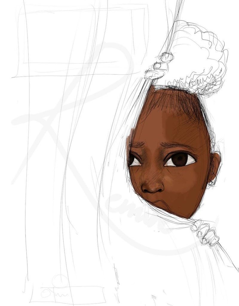
I started with a sketch. It’s very important that any design or artwork begins with a sketch. It’s simply the skeleton of an artwork/design and it serves as a foundation as well. Everything that was created revolved around it. Flat colours were then added to determine the skin tone of the girl, and where I’d like some highlights to be.
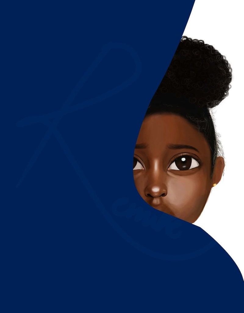
Mild details were then added to the girl’s face. The area to be occupied by the curtain was also defined by a flat colour. I chose to work with cool colours (blue & green), for the curtain to create some form of balance in between warm and cool colours as skin tone of the girl covered warm colours already.
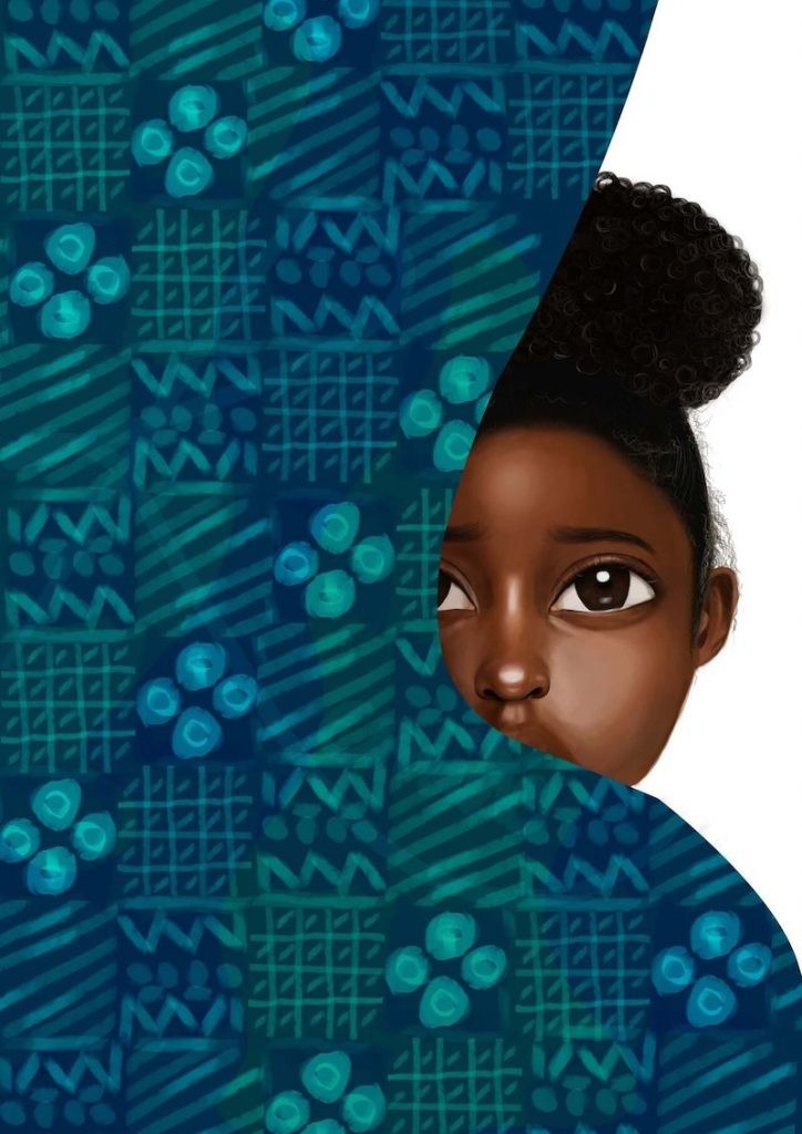
Patterns were added to the curtain to make it look like it was made with batik fabric and to add an extra touch of African culture to it. More details were also added to the girl’s face and hair to make for definition and to make her look for realistic.
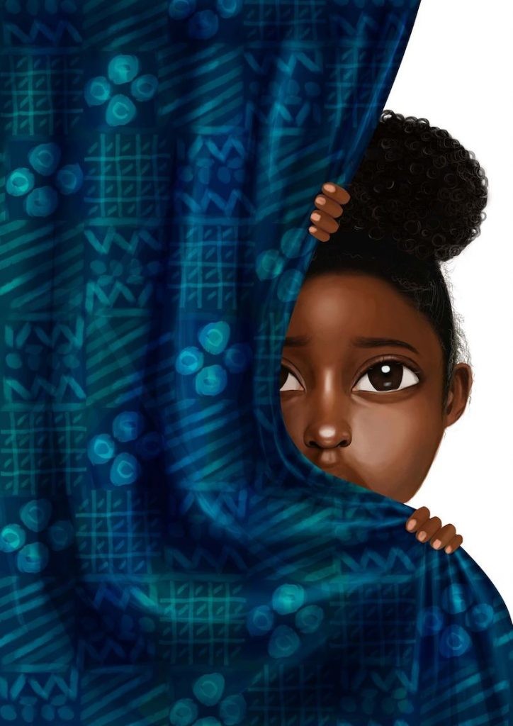
More details—shadows, mid tones & highlights—were added to define the folds in the curtain, especially where it’s been held on to.
In this stage, a dark background to the illustration simply to create a mood for the painting and emphasize the concept of hiding and silence. After doing that, I noticed it had no life per se. Therefore, I decided to mentally picture a lantern by the side of her face, hence the strong warm light on the side of her face. This was done to make the illustration look lively, to set the ambiance which I originally wanted to portray and to simply demarcate the dark parts of her skin and hair from the dark background.
Result
Voila! The book cover was done. The font used was intended to be bold, yet mild/soft. I felt it was very necessary to create a relationship between the softness and innocence coming from the aura of the child and the font used. I used the colour white because I believe the title of the book is as important as the cover art. So it had to be very clear and legible. My client loved it & I’ve gotten tons of positive feedback from people about the cover art, so I’m going to count that as a win
Reviews
The capacity for book covers to set the tone for the reader experience cannot be overemphasized. For a book that focuses on women forced into silence and affected by any form of abuse; the choice of a young innocent child, with a face that speaks but is silent—mouth covered and showing a hidden pain that is not being spoken about—readily invites us into learning more and wanting to hear those stories.
The subtle use of light and African Batik was loaded with meaning for me—the roles our society plays in the silence and the possibility of a light at the end of the tunnel if these conversations spark the needed attention. It is an exciting effort.
Ope Olugbemiro, Communications Lead, FourthCanvas
I really enjoyed the process and the result. I think it solved the problem, covered the essence of the book. I love how the cover was drawn directly from the book, that adds authenticity and originality not just to the cover but to the reader’s experience. The only question running through my mind is could more work have been done on the typography of the cover – emphasis on “Silence” either with a different font or colour. Just a random thought. Kudos to Morenike, amazing work.
Oreoluwa Shonibare, Lead, WiiCreate
A powerful story with such a well-executed illustration, on seeing the initial sketches, I already knew I had to be prepared for something beautiful at the end.
Feyisayo Sodimu, Product Designer, Cowrywise
I don’t get this very often but occasionally I come across artworks that are so relatable, I could almost hear them speak to me as audibly as the sounds in my surroundings.
Philosophically, from sketch to voila, this artwork is a story itself, the tales behind the beautiful African skin, the horror that her eyes reflect, the innocence of holding on to a curtain as though a shield to protect her when sighted, even a vital information that many may brush past: a dark background, it is perhaps the most haunting experience as an African child to come from a dark past, be in a dangerous present and still observe an uncertain future, which is what this artwork aptly captures.
Artistically, finding a subtle balance where the artwork and other elements on the same page synergize and command virtually equal attention is rare and this is why I doff my proverbial hat to this artist, from the soft, dark and ominous colors, the recognizable African patterns, even to the font choice and color which is both a sharp contrast from the background yet an integral part of the whole mood, this art piece is an easy A+ from me.
Betiku Adedoyin, Designer, Brand Consultant
Other Posts
So You Are a Senior Designer?
Design Nudge: An Approach to Creating Human-Centered Designs.
