Career and Life Lessons from 2 Years as a UX Researcher
24 May 2019
11 Mins Read

Feathers Creative Studio
Evolving towards the future, connecting the past – Feather’s Rebrand
Background
From the existing brand concept centred on upholding excellence in the design community, Feathers has further evolved into a much more elaborate identity now centred on opportunities. We discovered a whole world of opportunities out there, and we are now laser-focused on helping people fly towards them. Feather by feather you grow your wings, spread‘em, take a bold leap and fly towards the enormous opportunity awaiting you.
Our new obsession is Opportunity. Opportunities. It’s all we see, feel, hear, gossip about and fly towards. The openness of these opportunities is what we now choose to care about.
Along with our newly found focus on opportunities, we are also embracing a new attitude of openness. Bring these together and you find yourself in an infinite world of open opportunities.
We now require a brand system to efficiently communicate this new set of values to our audience.
Statement of Problem
The key task is to develop a system that is fun, exciting and visually stimulating to our new focus audience while still keeping things professional.
With these, our design team created a system that is easily replicable and own-able by our several scales across our several locations.
Solution (Approach, Rationale, etc)
Embracing the new — The System
Our brand system captures the essence of our new philosophy by morphing the core of our progressive past into clear cut representations of the emerging future through our logo, composition, typography, colour, motion, tone, photography, illustration and pattern.
THE LOGO
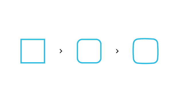
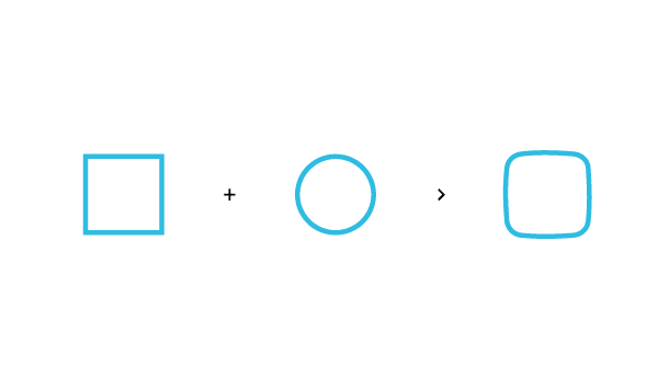
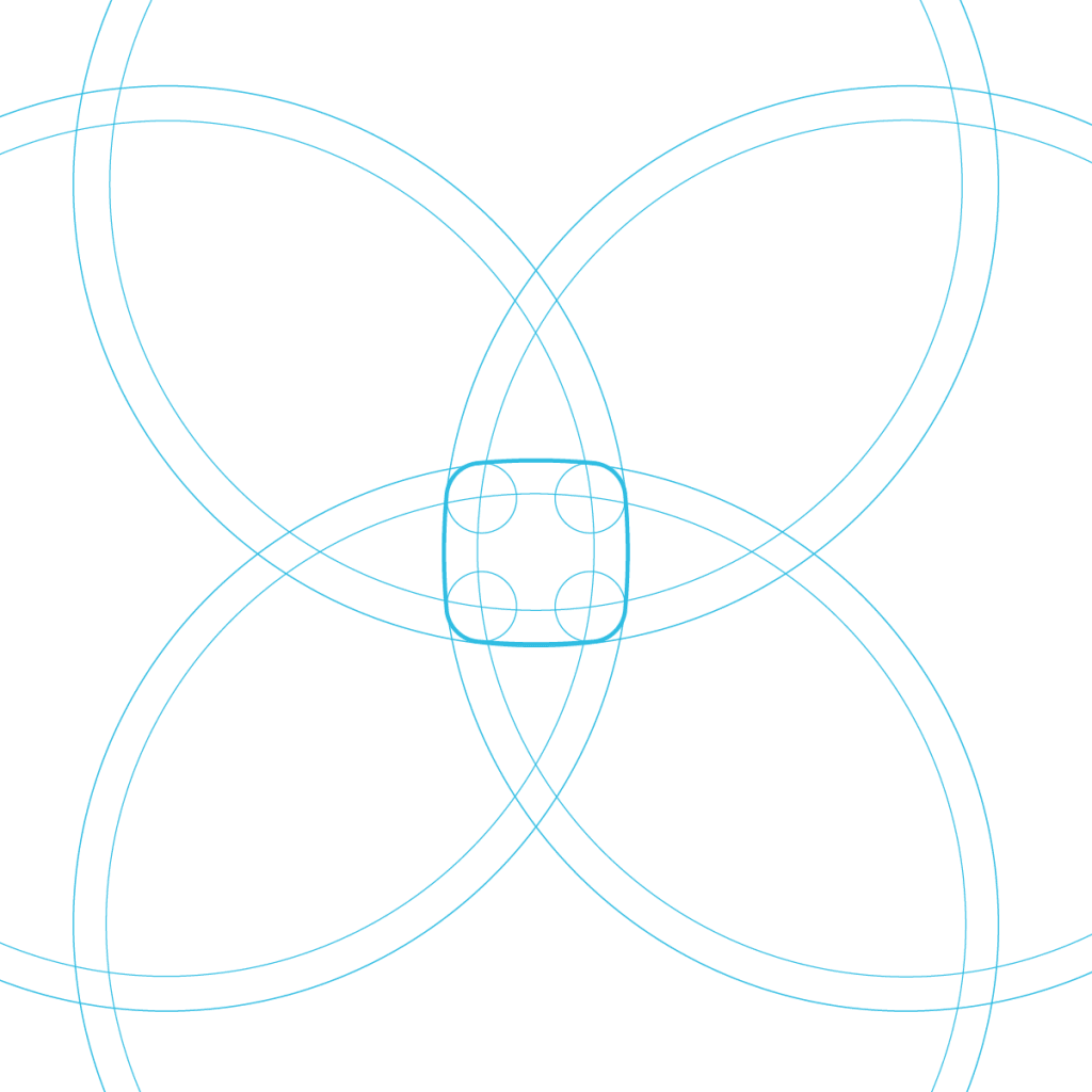
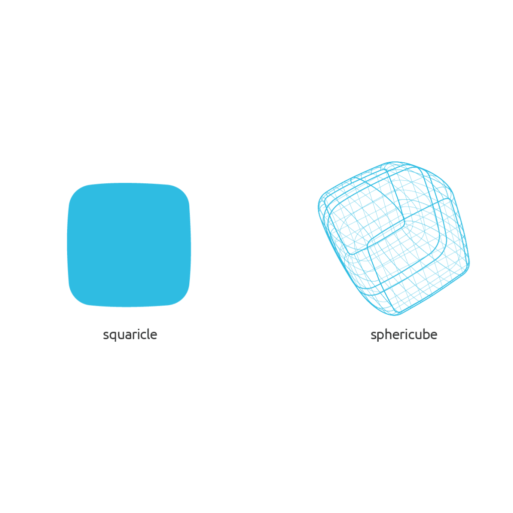
OUR LOGO is a fusion of two key concepts, stability and change. The square representing stability and the circle representing change (the infinite world). The resulting shape (squaricle) gives a fine balance between the two.
Our logo communicates our openness to change and a continued effort to achieve stability. The curves also depict the strong bond of unity in our community.
The feather inset in our logo has been re-imaged to be iconic and contagious, emphasizing a perfect smile, the satisfaction you get from experiencing a world of open opportunities.
Logo in use
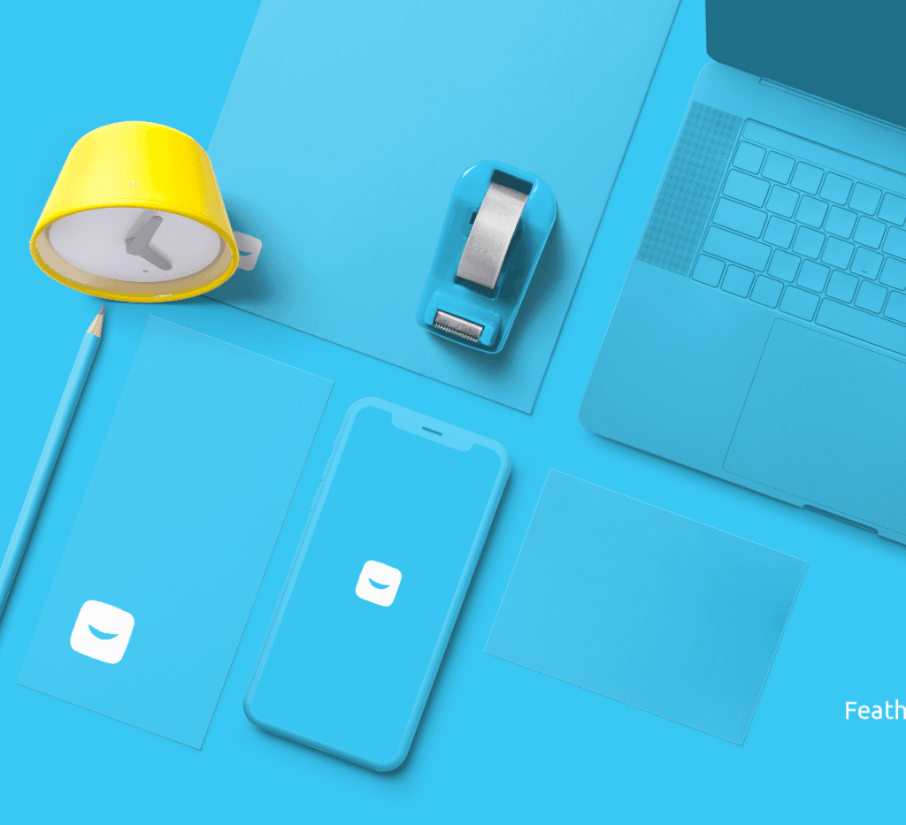
At every point of contact, we want our logo to be emphatic and endearing.
Going beyond
Our logo isn’t just confined to a plane surface, it transcends to the 3-Dimensional world, as the world embraces virtual and augmented reality.
3D environment
In the 3D environment, our logo plays a key role in harnessing surrounding materials to re-enforce the identity in the mind of our audience. From everyday office materials to fun objects, we explore the use of the new shape in tech materials, smart devices and gadgets.
Composition
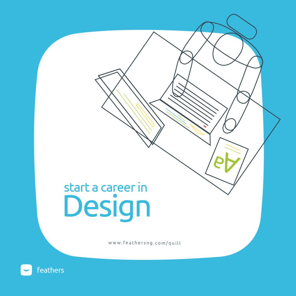
Our composition is flexible and easy to replicate across several of our mediums and platforms. It plays on our unique shape to show openness to opportunities. We decided to play on the Fibonacci and the rule of thirds to give balance and visual hierarchy to the most important information for ease of consumption.
Typography
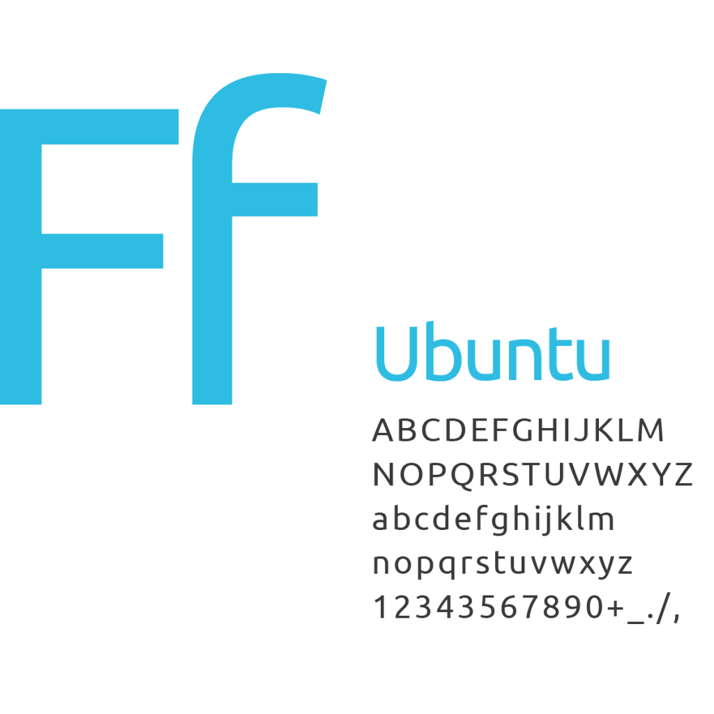
Our typography is simple, spacious, and readable. Its anatomy is in sync with our logo structure. Round edges and slightly bulged vertices.
Colour
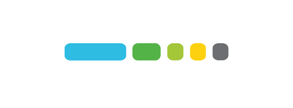
Our colour is vibrant and stimulating. It expresses our openness to opportunities.
Motion — “Zoom! Morph!! Fly!!!”
Our motion works on basic animation principles to help create cohesion and interest in the key information by organizing the sequence and timeline. The transitions play on our key essence. “Open opportunities”. So it’s a zoom in to our logo shape or a remove to the shape of the screen.
Tone of voice — “*clears throat”
Friendly, less of Jargon, engaging and professional.
Photography — “say cheese!!!”
Our photography directions aim to show our community and our creative works from several of our members across several locations. It aims to engage and spur excitement in the audience. So, should capture passion and vibe.
Illustration
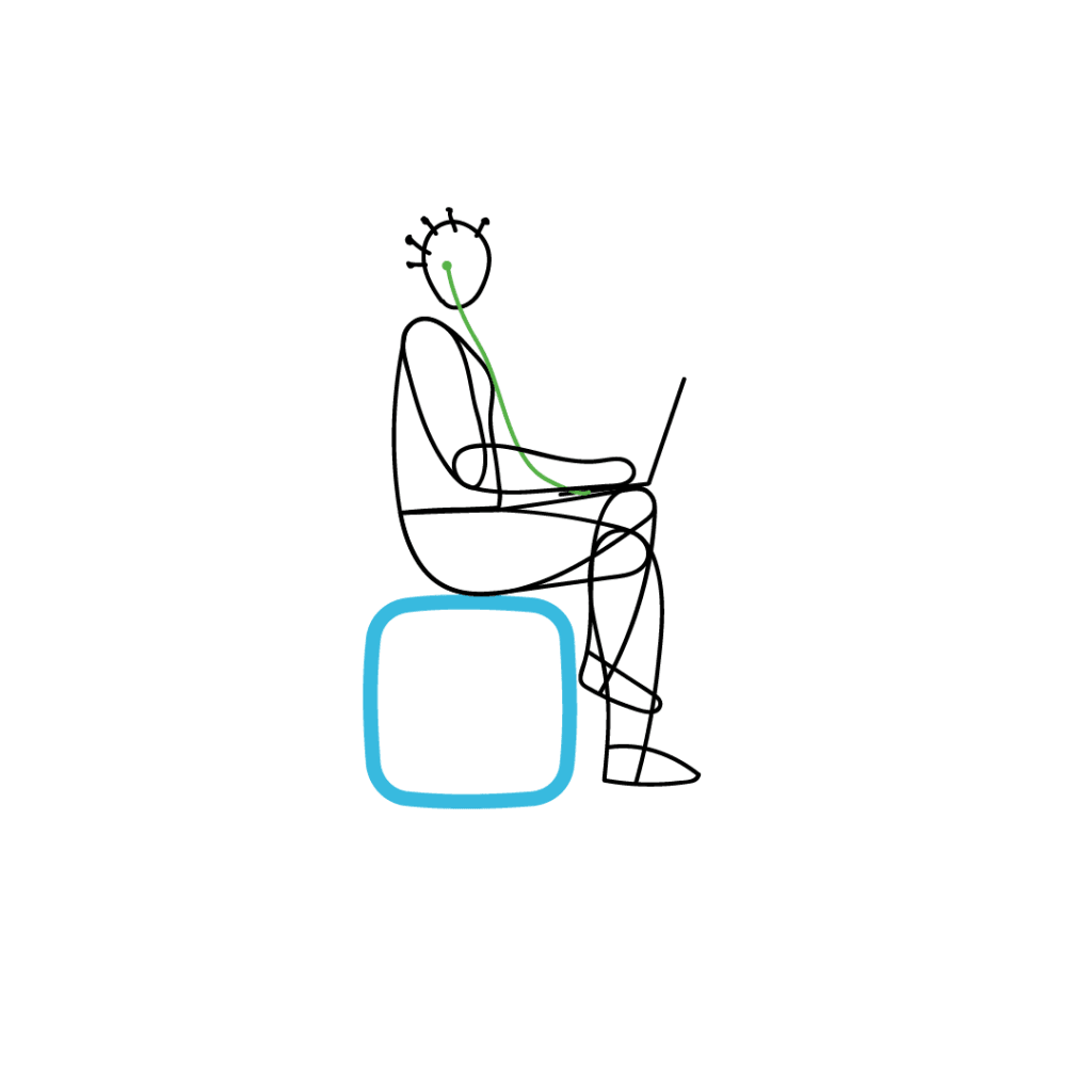
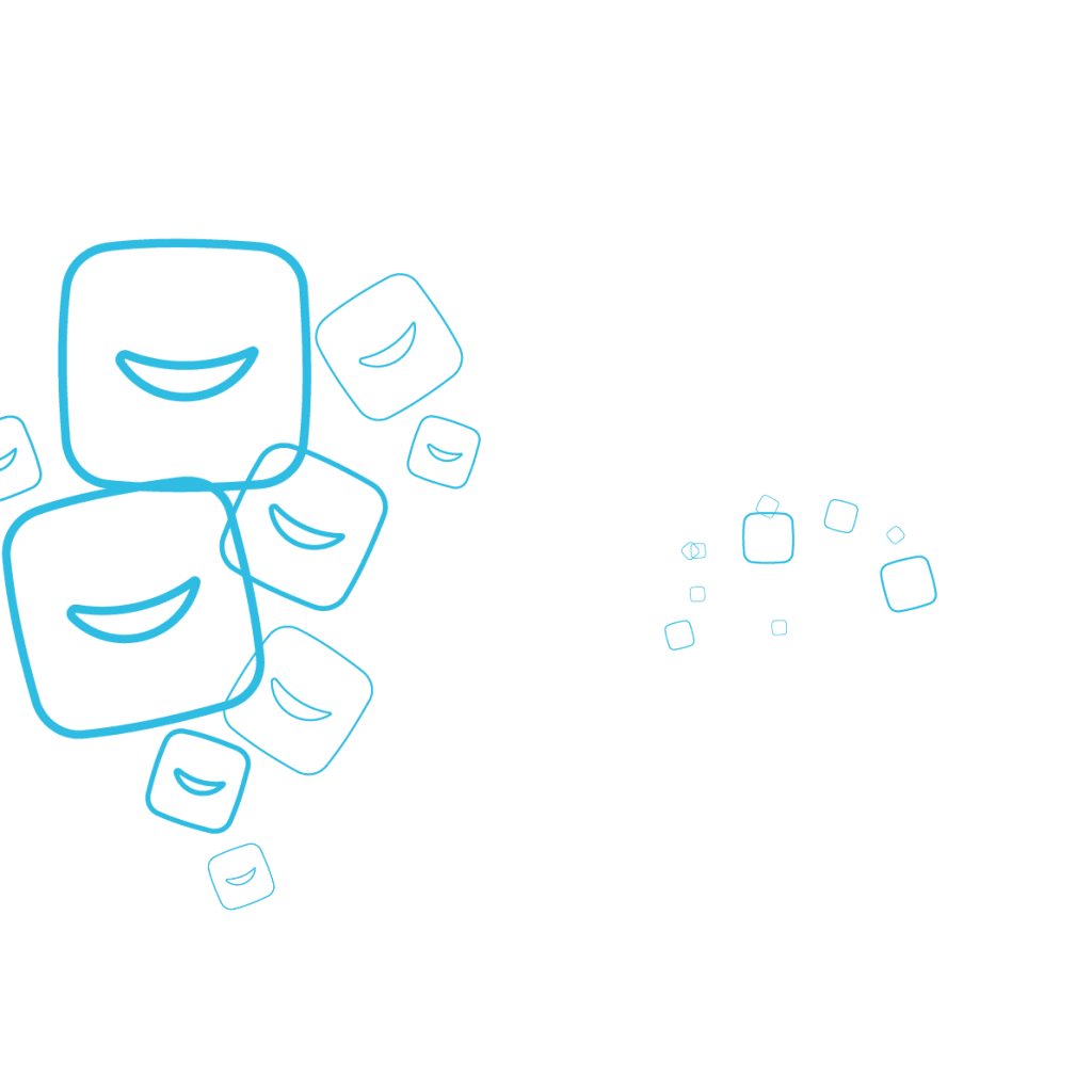
Our illustrations are expressive, reinforcing our brand elements in creatively engaging ways. The artistic expression in outlines is used to denote openness and transparency, it’s our new embrace.
Pattern — watch out for these
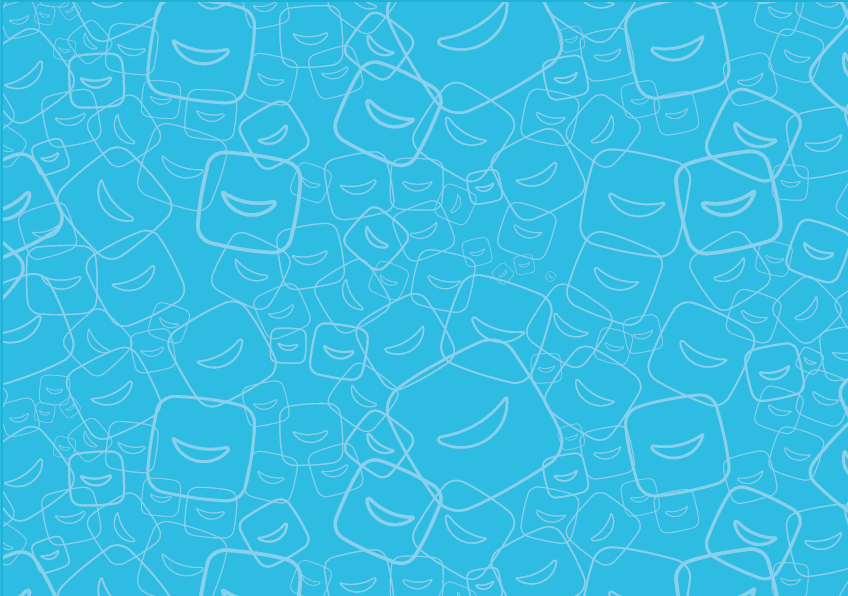
Our pattern is composed of our logo element in a fun and subtle way to bring excitement to plane surfaces. Our pattern aims to harness our brand elements in several materials.
Result
Our Pattern Expression
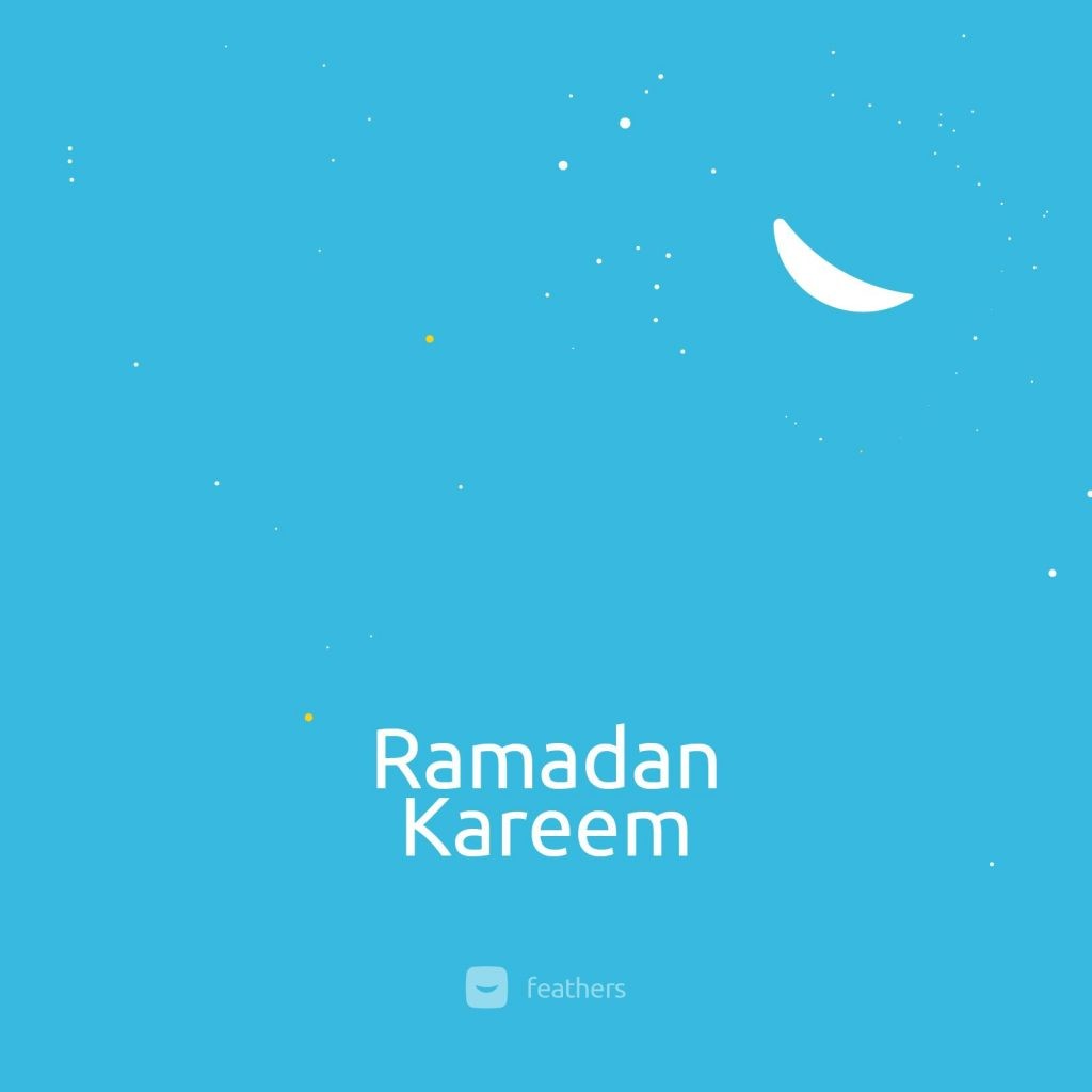
Since this re-brand we have done some brand usage of our logo in a creative and such that is conceptual to the various event and celebration of memorable days including: Workers Day, Mothers Day, Celebration of the Ramadan in the feathers way showing how flexible the new re-brand is.
What to look out for…
Over the coming months, the new direction will roll out across our brand expressions, including the website, new software applications, in prints and in our physical spaces and we do hope that every interaction with our brand offers the incredible opportunity to build a relationship and fortify our position as a force that can successfully drive you towards the immense career and life-changing opportunities that have been opened up to you.
Cheers!!!
Reviews
Uniqueness
*The “smile” idea in a logo looks very cliché. I think the feather from the previous logo would have made a unique identity because it reinforces the brand name (feathers) and still passes for a smiley face.
Appropriateness
*The combination mark works perfectly well and allows for flexible use.
*The colour/ shape/ typography have very defined characters compare to the previous identity and serves as strong brand assets.
Simplicity
*The simplicity of this identity makes it easy to remember.
*When scaled down, the logo is still recognizable.
Application
The extensive application of the identity was very thoughtful and intelligent.
– Sojii Oyemomi, Founder, Episod X
I think Feathers is a great rebranding project,
I like the fact that the company was so clear on their new direction and the rebranding actually was spot on, all the way. I can see a lot of professionalism in there as well.
Overall, I will give this a 85%.
– Oluwamayowa Oshidero, Managing Partner, Tinkling D
I love the concept behind the logo design, It was quite impressive; the creativity, the simplicity, the color blends are absolutely astonishing. I love the thought and ingenuity Incorporated into the design. I also love that the logo looks like a feather and a smiley face. That’s really epic, I literally smiled when I saw it. Plus it looks good on anything, be it a cup, shirt, anything.
In one word, the design, pattern, font, everything is simply classy. I commend the designers and everyone who worked on the project. It’s simply brilliant.
Cheers
Soetan Oluyemisi, Physiotherapist
This looks more of a smile that a feather.
The thing with words that mean something when creating a visual identity is that it’s nearly impossible to convince people that that word means something else.
I would think the design team should have found a way to integrate the feather into this smile.
Overall I think this is a lovely execution and interpretation it’s also very simple and has a story behind it. Outstanding work from the Feathers Design team.
Osaretin Avbuluimen, Managing Partner, Jonathan Cole
Other Posts
So You Are a Senior Designer?
Design Nudge: An Approach to Creating Human-Centered Designs.
