


Career and Life Lessons from 2 Years as a UX Researcher
06 December 2019
7 Mins Read

Ayomide Ajibode
Designing Education Beyond Walls
Background
In 2018, Union Bank launched Edu360, a platform to drive much-needed reform within the Nigerian education sector. The anchor initiative of the Edu360 platform was an annual education fair created with the aim to:
· Facilitate critical engagement between key stakeholders in the sector across government, civil society, private sector and educational institutions
· Provide essential teacher training for public school teachers
· Expose students across all education cadres to experiential, STEM and creative learning
The first edition drew over 3,000 attendees with over 200 teachers receiving free training from renowned consultants.
In 2019, in line with the theme ‘Education Beyond Walls’, the bank focused on highlighting the various ways education occurs beyond the classroom walls, and how non-traditional education methods can play a vital part in solving some of the issues facing the sector today. Non-traditional education methods include e-learning, play-based learning, robotics etc.
Beyond this, the event also aimed at exploring non-traditional methods of teaching and learning being used today such as Youtube, creative arts programs, digital content and gaming.
Challenge
The design team at Union Bank was given the task of coming up with visuals for branding the 2019 Edu360 event. The brief was to develop visuals that were colourful, dynamic and would ignite excitement and enhance the overall experience of the event.
Moodboard
Solution
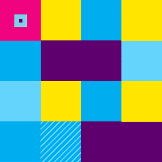
Using the five pillars of the event – (Imagine, Explore, Observe, Discover and Achieve) as a base, a 4 x 4 grid square pattern was developed.
This consisted of primary elements, secondary elements and complementary shapes. The primary pattern was also further simplified to create supporting patterns which were all used to create a holistic visual experience for the event.
Applications
The design team worked closely with internal project owners and external vendors in designing the invites, exclusive merchandise, communication materials, packaging, event materials, conference hall, exhibition hall, registration tags, outdoor branding and content materials for the digital screens.
Pattern Animation
To give more life to the approved pattern, each of the elements in the pattern was animated and brought together to create a whole new experience. Each of these animated elements was also used as a transition for video materials for the event and lastly used to create an exciting logo reveal.
Credits
Pattern Illustration & Animation
Designers
Design Lead
Reviews
Education typically incites thoughts of boring lectures and tedious textbooks, so it’s refreshing that the art direction taken here embodies the essence of Edu360. The vibrant colours suggest that perhaps learning isn’t a somber affair. Purple, yellow and blue are just lively enough to grab and entertain your attention without being too busy on the eye. The icons subtly hint at academia, so that the core of the communication isn’t lost in the flair.
The motion graphics were also a smart idea, adding more life to the already lively branding. My only gripe visually is the use of boxes for the patterns, squares are naturally confining and take away from the message of learning without limits. Overall the branding serves its purpose and would be appealing to the entire spectrum of its intended audience.
– Wayne Samuel, Spoken Word Artist. Copywriter, TBWA.
Very thrilling and soothing to look at. You can’t but love this piece. It’s cohesive and properly signifies a brilliant translation of the brief into reality. Beauty and function combined into one.
– Ayodele Adeleke, Product Designer, Versecom.
This is a job well done. One of the signs of a serious brand is their attention to detail and consistency. I value the fact that the design team was allowed to work closely with vendors and project owners to see to the perfect execution of the creative expressions. It is one thing to come up with smart design solutions, and it is another thing to have the solutions applied accordingly on touchpoints—a leaf other bank brands need to borrow.
– Ayomide Ajayi, Strategy Lead, FourthCanvas.
I love the colors! I appreciate the painstaking effort that went into selecting the complementing color pallets; it gave the project all the life it needed.
Every design execution must speak to 2 things at the very least; the problem statement/brief (exhaust the brief) and the target audience (attract and talk to them).
This body of work spoke to the latter boldly than former. I expected more fluidity and futuristic design elements/expressions to align with the core of the brief ‘Education Beyond Walls’ to fully exhaust the brief.
–Tunde Ogunkunle, Architect & Art Director, Paga.
Dear DesignerDesigners in Nigeriaedu360Union Bank
Other Posts
So You Are a Senior Designer?
Design Nudge: An Approach to Creating Human-Centered Designs.