Career and Life Lessons from 2 Years as a UX Researcher
24 May 2019
5 Mins Read

Kajopelaye-Ola Abodunde Taiwo
Creative Candy Garden Illustration
Background
Creative Candy Garden illustration is a 30-minute project-based video tutorial that teaches the foundation of colour, light and shadow using Adobe Illustrator (AI). The target audience is designers with essential knowledge of AI, willing to take on advanced challenges to improve their knowledge and skill with the use of AI.
Statement of Problem
The task was to create a colourful candy garden with exciting colours that can be used to teach the concept of colour, light and shadow using certain tools and features in AI.
Solution (Approach, Rationale, etc)
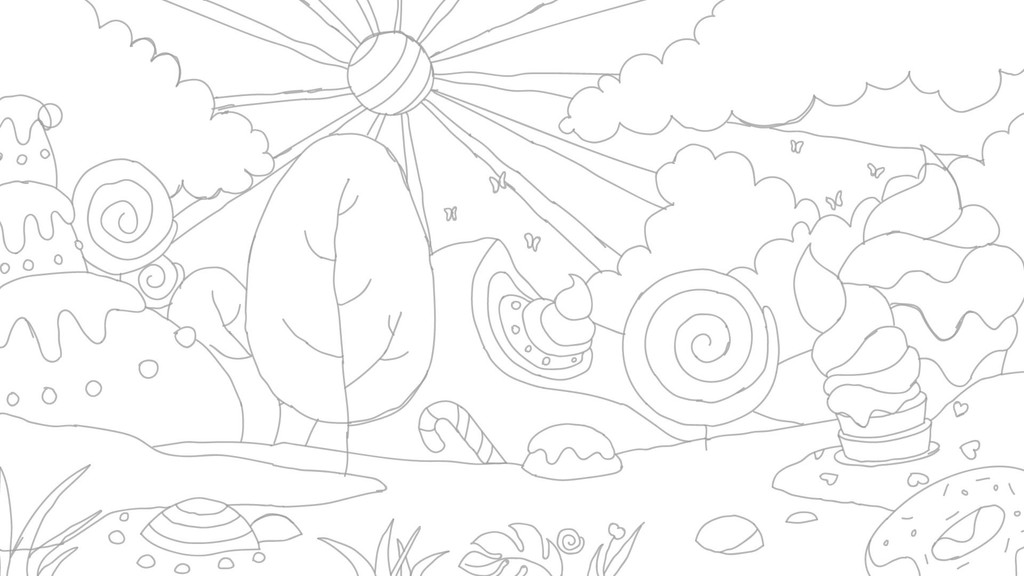
The project started by researching on types of candies after which some sketches of different types of candies to represent a garden were created. After several sketch attempts paying attention to composition ideas with proper use of space, a refined sketch was created.
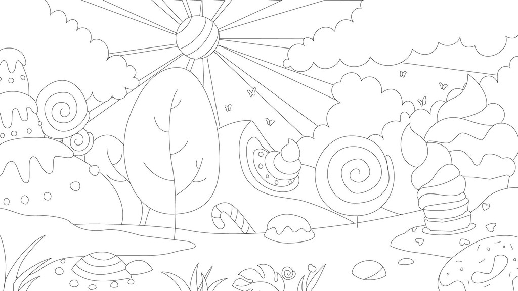
Using the sketch as a guide, the line art was created and organised into separate layers.
Subsequently, the base colours for each of the elements were created. In this section, the concepts of colour harmony, colour measurement and colour luminance were explored and explained.
Finally, lights and shadows were added, shifting hues, and experimenting with their values and saturation level to create the illusion of three dimension on a two-dimensional surface.
Result
At the moment, seven students are currently taking the course. Although, there hasn’t been a deliberate effort of developing marketing strategies to promote and create awareness.
The project tutorial can be checked here: https://skl.sh/2UZ0bMr
With this link, you can get two free month premium subscription which can be used to take the tutorial and any other tutorial on the platform
Reviews
The final illustration reminds of the Candy Crush game. The environment is quite inviting. I could almost imagine myself in it. The use of colour is quite impressive. A great blend of warm and cool colours. The shadows hit at appropriate areas. Accentuating the depth of the whole illustration. The most impressive part of the whole illustration will be the dripping candy depicting the Sun. It’s quite the eye candy.
Overall, I think the process explained in the tutorial should help a lot of illustrators in this area. Great work. I liked the tutorial introductory video on Skillshare too. Well done.
Sheyi Owolabi, Co-Founder, Dream Theatre
Colour, light and shadow are fundamental concepts of design that every designer should know. This project’s concept and approach using video tutorial is good as the combination of visuals and hearing provide a better learning atmosphere.
The execution is quite detailed and clear, however the use of more realistic images and animals will further show what is possible and create more complex colour shades to learn.
Fiyin Adebayo, Software Engineer, Andela
Art is life and creativity is best delivered in brevity and simplicity, that is what the Candy Garden illustration portrays.
A pristine potpourri of captivating colors laid over a relatable background, this project unravels the beauty of arts, of nature and the serenity embedded therein.
The concept of light and shadow, a contrasting reflection was well depicted, and the radiant rays the picture radiated is a light to every gaze that beholds it. In a world full of Loom and gloom, this is a project worth giving a room to bloom.
Emmanuel Faith, Writer, Poet and Author of “Chronicles of An Intern”
I think this solved the background problem of creating a garden with exciting colors. The colors used are definitely exciting and harmonious.
Debby Bashorun, Fullstack Designer
Other Posts
So You Are a Senior Designer?
Design Nudge: An Approach to Creating Human-Centered Designs.


