Career and Life Lessons from 2 Years as a UX Researcher
18 September 2019
5 Mins Read

Ibukun Shobola
Book Design, as it should be.
“Books are conservative. Doing too much is a dangerous attempt at distracting the reader. So be simple and minimal.”
(paraphrased)
Those were the words of a former employer when I started editorial design. By Editorial Design, I mean books, articles, financial business reports, coffee table books, novels, and everything print and paper. I had been given a simple task to do but as a young designer who basically knew nothing, I was thinking too hard to make it look so colourful and busy. I didn’t know that design, even the simplest, is first a business of function and then aesthetics and my definition of aesthetics as at the time was basically “busy”.
This was a defining moment in my career as a designer and most importantly, a book designer.
While people think that almost anything can go for a book or any designer can design a book (considering the flexibility of ideas and concepts), layouts require more attention to details, I can tell you that I’ve made a few mistakes while learning on this journey, costly mistakes at that —the kind that costs your employer or client huge payment or makes you trash thousands of copies to reprinting new thousands.
If you are a younger designer coming through the ranks with this experience, you’re not alone. Lol. Mistakes are how you learn.
I’m going to be talking mostly about novel layouts in this article. Not a lot of designers, even writers and readers know that how a book is laid out affects the flow of reading. Of course, the importance of the sweetness of the story cannot be overemphasised but if you really want to help the reader focus on that sweetness and avoid distractions, keep it simple. Sadly, you almost always have to be a designer or be extremely familiar with books and editing to spot these loopholes, although as a reader, you may have a feeling that things are not right, but you are not just able to point them out.
Simplicity here talks about a lot of space (not excess, just perfect), font choice, line spacing, margins, and of course, proper bleed for prints.
While it’s possible that printers can screw up a print, you have to ensure that there are safety nets on all sides and that when push comes to shove, the only person we’re beating up is the printer, not you, if at all we have to beat anybody (lol).
I actually quite agree that there are no rules to anything because sometimes innovation requires breaking a lot of rules. However, there are basic rules that should guide every aspect of design. In fact, to break the rules, you have to know them so well. This is the reason why every designer (even developers), has to at one point in their career, design a book or learn the ropes. It can help set a foundation for arrangement, alignment, font and leading choices.
One other thing to consider in book design is the resolution.
Personally, the blurriness that comes with low-res photos annoy me but sometimes you have to deal with clients who reiterate in a strong voice “use it like that”, and you really do not have a choice. You have to “use it like that”. Some even send you pictures in MS Word. *tears *. And are you even a designer if they haven’t told you to fetch “Author Picture” from Facebook?
Until recently, when we started having digital options, books are usually printed and the importance of high-resolution JPEGS cannot be over-emphasized. Even as books become digital, high-resolution images should never be compromised. The advent of good phone cameras getting more pixels with every brand upgrade, should mean, No excuses! Demand high-resolution pictures.
Lastly and most importantly, before starting a book layout, ensure that both the author and editor have done the thorough job of ensuring that all is well with the manuscript and it requires very little or no editing before heading out to print. Considering that there’s going to be an intense proofread of the layout, this will save you a lot of back and forths that comes with proofreading. Proofreading time really isn’t editing time. Set this up straight with the author. In this business, time is money and you don’t want the things you should’ve avoided from the start to take all of the time you could have spent on other projects.
I guess we have to stop here until next time, until then, note one thing:
Attention to Details is the God of Design!
Ibukun Shobola
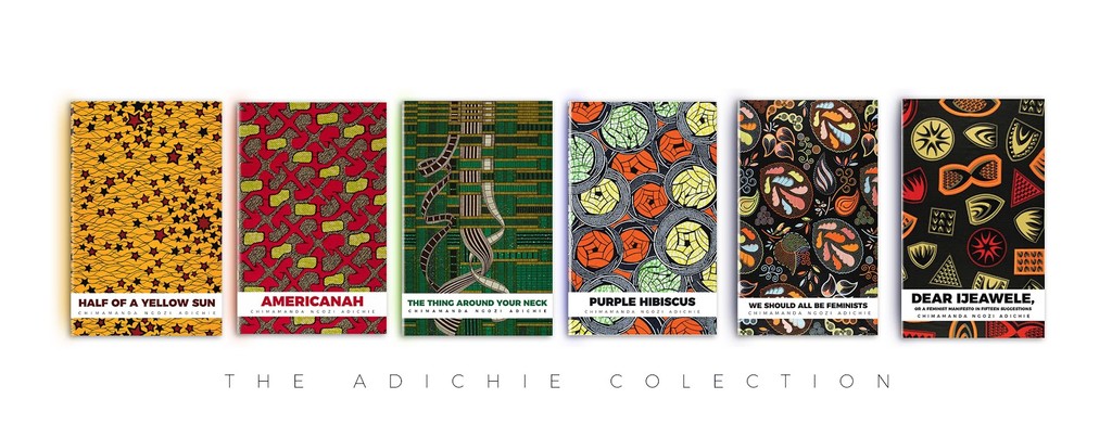
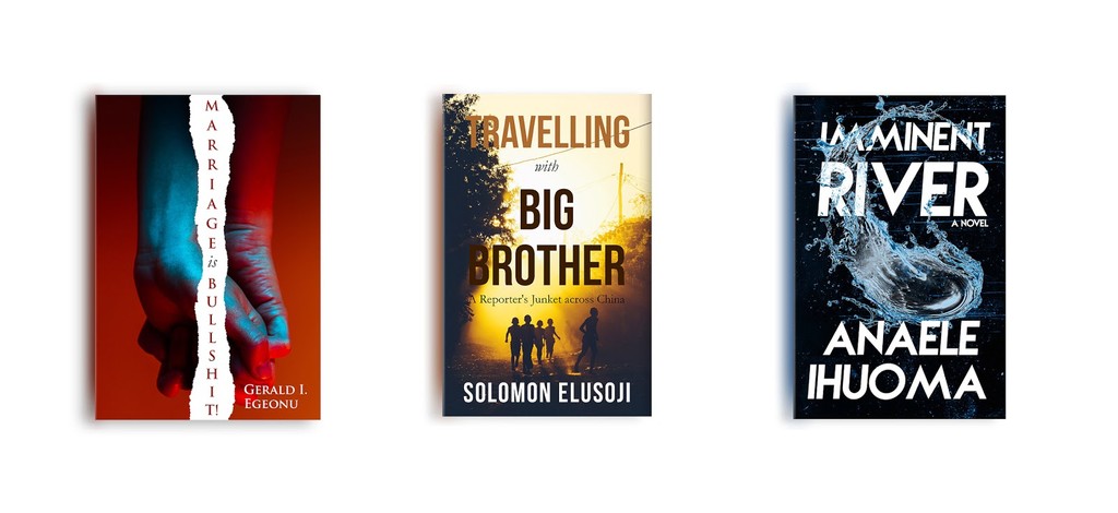
Ibukun Shobola is the lead designer at Showballer Visuals, a growing design company with strength in book/publication designs and layouts. Since his graduation from the Department of Theatre Arts, University of Benin, Ibukun has acquired experience working with Kachifo Limited and Narrative Landscape Press; designing for remarkable Nigerian authors—Chimamanda Ngozi Adichie, Omoni Oboli, Bayo Olupohunda, Ayisha Osori, Nkiru Olumide-Ojo among others. He has a certificate in business development, branding and strategy from 02 Academy, Lagos. He is also a guitarist, part-time actor and model.
Other Posts
So You Are a Senior Designer?
Design Nudge: An Approach to Creating Human-Centered Designs.

